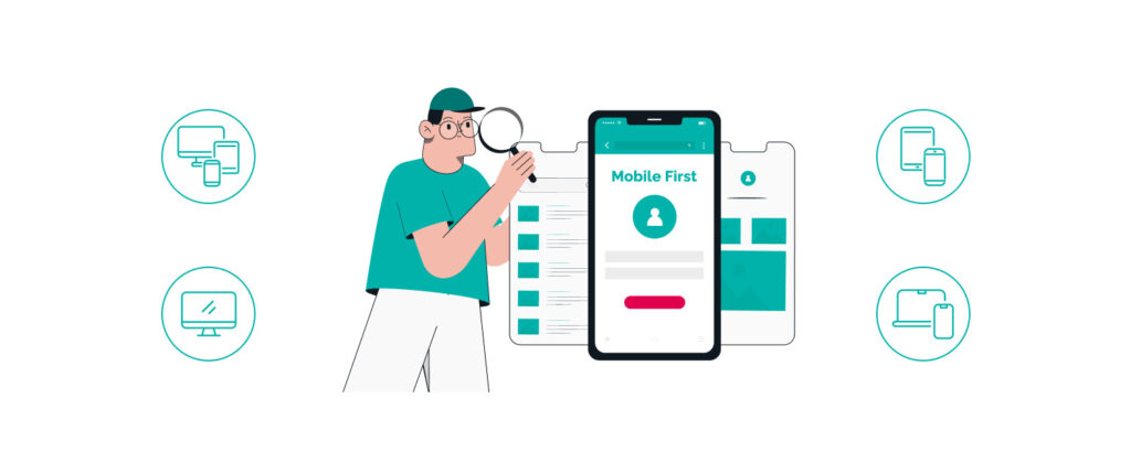
Why Mobile-First Design: Future of Digital Marketing Success
In a digital landscape dominated by mobile devices, adopting a mobile-first design is no longer optional but essential for marketing success. Prioritizing mobile users enhances user experience, boosts search engine rankings through optimized performance, and increases conversion rates with responsive design. By leveraging mobile analytics, marketers gain invaluable insights into user behavior, enabling data-driven strategies that propel campaigns forward. Looking ahead, emerging trends in mobile-first marketing promise to further revolutionize the way brands engage with their audience. Embracing a mobile-first approach empowers businesses to stay competitive and achieve sustained growth in the ever-evolving digital marketplace.
Enhancing User Experience with Mobile-First Strategies
In the cutthroat world of digital marketing, adopting a mobile-first approach is no longer optional—it’s essential for sustained success. By prioritizing mobile users in every design decision, businesses can deliver a seamless and intuitive experience that keeps customers engaged and drives conversions. Brands like Uber and Airbnb have mastered this strategy, showcasing mobile-optimized interfaces that not only look great on smaller screens but also ensure fast load times and easy navigation, significantly enhancing user satisfaction.
When comparing user engagement metrics between mobile-first and non-mobile-first designs, the advantages are clear. Mobile-first websites typically experience higher conversion rates, lower bounce rates, and increased time on site. Here’s a snapshot of the difference:
| Metric | Mobile-First Design | Non-Mobile-First Design |
| Conversion Rate | 3.5% | 2.1% |
| Bounce Rate | 45% | 60% |
| Time on Site | 5 minutes | 3 minutes |
Embracing a mobile-first strategy not only caters to the growing number of users accessing content via their smartphones but also future-proofs your digital presence. Ignoring this shift can lead to missed opportunities, reduced engagement, and lagging behind competitors who have already made the switch. In the fast-paced digital landscape, a mobile-centric design is the key to unlocking long-term growth and marketing success.
Boosting SEO Rankings through Mobile Optimization
Embracing mobile optimization is no longer optional for businesses aiming to climb the search engine rankings. Search engines like Google prioritize mobile-friendly websites, ensuring that users receive the best possible experience regardless of their device. By focusing on page speed and ensuring your content is easily navigable on smaller screens, you can significantly enhance your SEO performance.
Experts agree that certain SEO practices are paramount for mobile success. Implementing responsive design, optimizing images, and utilizing structured data are critical steps in ensuring your site meets the highest mobile standards. Additionally, maintaining a clean and intuitive layout not only improves user engagement but also signals to search engines that your site is user-centric.
- Google Mobile-Friendly Test: Assess how easily a visitor can use your page on a mobile device.
- PageSpeed Insights: Analyze the content of your web page and generate suggestions to make that page faster.
- Mobile SEO Audit Tools: Comprehensive tools like SEMrush and Ahrefs offer in-depth mobile SEO analysis.
Increasing Conversion Rates via Responsive Design
Adopting a responsive design isn’t just a trend—it’s a game-changer for your conversion rates. Imagine a visitor stumbling upon your site on their smartphone; if your layout effortlessly adapts, they’re more likely to stay and engage. Businesses that have shifted to responsive designs have seen up to a 30% increase in conversions. It’s not rocket science—providing a seamless user experience across all devices directly influences purchasing decisions.
Take, for example, a leading e-commerce platform that revamped its website with a responsive approach. Post-implementation, they reported a 25% boost in sales and a significant drop in bounce rates. These aren’t isolated incidents. Statistics show that responsive websites load faster and are easier to navigate, reducing friction in the buyer’s journey. By prioritizing responsive design, you’re not just keeping up with the competition; you’re setting the pace for higher engagement and sales.
leveraging-mobile-analytics-for-marketing-insights>4. Leveraging Mobile Analytics for Marketing Insights
Understanding user behavior on mobile devices is a game-changer for any marketer serious about staying ahead. By tapping into mobile analytics, businesses can uncover deep insights into how users interact with their apps and websites. This isn’t just about tracking clicks; it’s about comprehending the journey your customers take, identifying pain points, and optimizing their experience for maximum engagement.
Key metrics to monitor include mobile traffic sources and engagement rates. For instance, knowing whether your users are coming from social media, direct searches, or referral links can help tailor your marketing strategies effectively. Additionally, tracking how long users stay on your app or website, the number of pages they visit, and their interaction patterns can reveal what’s working and what isn’t. A compelling case study is how a leading e-commerce brand used mobile analytics to boost their conversion rates by 25% by optimizing their mobile checkout process based on user behavior data.
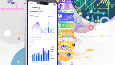
Presenting this data in a clear and actionable manner is crucial. Utilizing dashboards or infographics can make complex data sets accessible and understandable at a glance. Tools like Google Analytics and Tableau offer robust solutions for visualizing mobile data, allowing teams to make informed decisions quickly. By integrating these visual tools, marketers can seamlessly communicate insights across departments, fostering a data-driven culture that propels digital marketing success.
Future Trends in Mobile-First Marketing
Anticipating the next wave of mobile-first design means embracing innovations that transform how users interact with brands. Augmented Reality (AR) is set to redefine engagement by offering immersive experiences directly on mobile devices, making interactions more interactive and memorable.
Another game-changer is voice search optimization. With the surge of smart assistants, optimizing for voice queries will be crucial to maintain visibility and accessibility in search results. Additionally, the advent of 5G technology will enhance mobile performance, enabling faster load times and richer content delivery.
- Artificial Intelligence (AI): Leveraging AI for personalized user experiences will drive higher engagement and conversion rates.
- Progressive Web Apps (PWAs): Combining the functionality of mobile apps with the accessibility of websites, PWAs offer seamless user experiences without the need for downloads.
- Enhanced Security: As mobile usage grows, prioritizing robust security measures will be essential to build and maintain user trust.

Frequently Asked Questions
How does mobile-first design affect page load times?
Mobile-first design prioritizes essential content and streamlined functionality, which often leads to faster page load times. By optimizing images, minimizing code, and leveraging efficient caching strategies, websites can enhance performance on mobile devices, resulting in quicker load speeds and a better user experience overall.
What are some common challenges when implementing a mobile-first strategy?
Common challenges include ensuring consistent functionality across different devices, maintaining design aesthetics on smaller screens, optimizing for varying network speeds, and managing the increased demand for responsive content. Additionally, transitioning existing desktop-focused designs to a mobile-first approach may require significant redesign and development efforts.
Can mobile-first design improve user retention rates?
Yes, mobile-first design can significantly improve user retention rates by providing a seamless and intuitive experience on mobile devices, which are increasingly used for accessing digital content. Enhanced usability, faster load times, and responsive layouts contribute to higher user satisfaction, encouraging visitors to return and engage consistently with the site.
What role does mobile-first design play in social media marketing?
Mobile-first design plays a crucial role in social media marketing by ensuring that content shared on social platforms is easily accessible and engaging on mobile devices. With a majority of social media usage occurring on smartphones, optimized designs enhance visibility, encourage interaction, and facilitate smooth navigation, thereby boosting the effectiveness of social media campaigns.
How can businesses measure the success of their mobile-first initiatives?
Businesses can measure the success of their mobile-first initiatives by tracking key performance indicators such as mobile traffic growth, user engagement metrics, conversion rates, bounce rates, and page load times. Utilizing mobile analytics tools to monitor these metrics provides insights into user behavior and the effectiveness of design strategies, enabling continuous optimization for better results.